It's time to make some cards in bright summery colours and who else would I turn to but Craftwork Cards. The Craftwork paper pads are really good quality and I love their designs.
The paper pads I have used today are the Al Fresco and Habour Boulevard. Both of these paper pads remind you of warm days spent in the great outdoors. Not something I have been doing this weekend, other than to replenish my pot on the front door step with some fresh plants!
The first card has been stamped around the edges with sea shell stamp (Clarity Stamp) and painted with translucent H20s. Then I matted and layered the papers from the Harbour Boulevard paper pad and cut out the anchor with sea gull. I love the the beach huts.

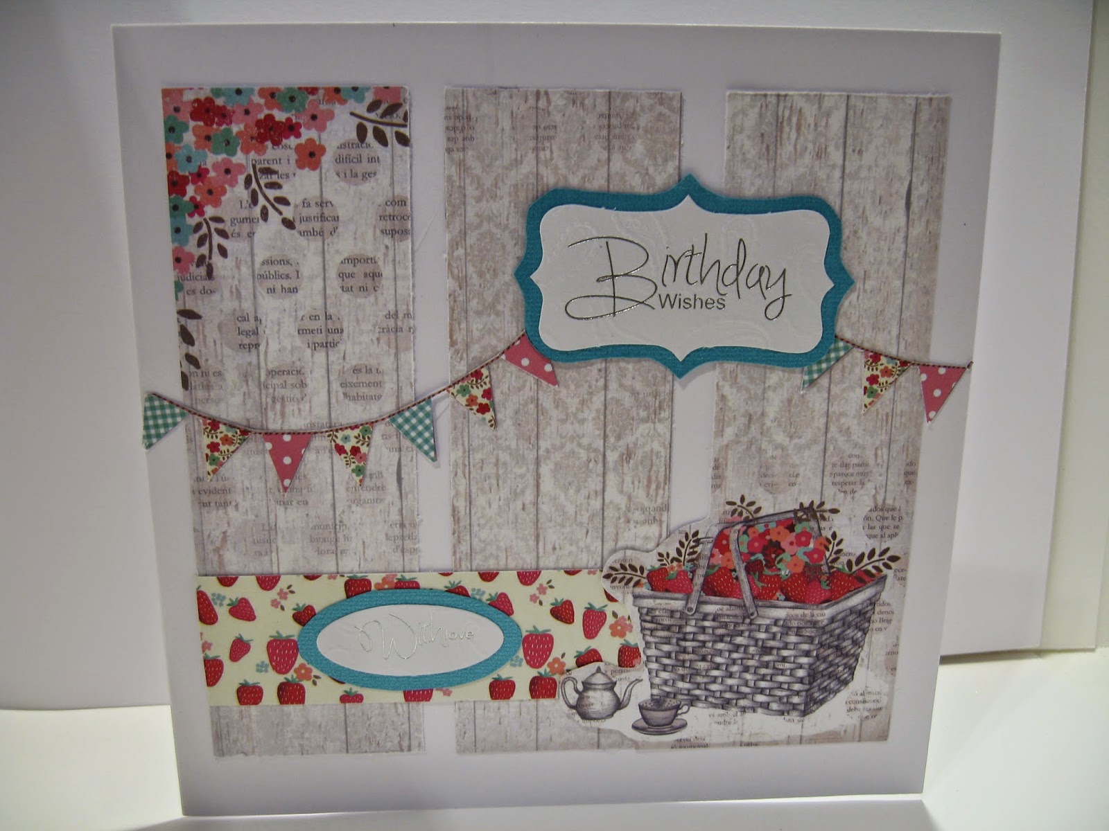
The next two cards were made from the Al Fresco paper pad. I love the bicycle and basket of strawberries.
Let me know if you have a favorite.

The paper pads I have used today are the Al Fresco and Habour Boulevard. Both of these paper pads remind you of warm days spent in the great outdoors. Not something I have been doing this weekend, other than to replenish my pot on the front door step with some fresh plants!
The first card has been stamped around the edges with sea shell stamp (Clarity Stamp) and painted with translucent H20s. Then I matted and layered the papers from the Harbour Boulevard paper pad and cut out the anchor with sea gull. I love the the beach huts.
The next two cards were made from the Al Fresco paper pad. I love the bicycle and basket of strawberries.
Let me know if you have a favorite.

